Friday, 27 November 2009

Dvd cover final


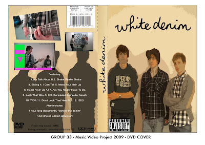
This is the final design for our dvd cover, in the end we decided to change the design from the rough draft version we had planned. We have still included the picture of the band striking a pose and the white denim logo however we edited the logo in photoshop so that only the text remained on our new background.

Feedback

we think this is very good, we like the way the image carries on over both sides of the box, the editing is very good

Like the way it looks complete with a theme not so happy with the picture on the back I think takes away from the over all look

Final Advert

This is the finished advert.

It has good continuity with the video, and it fits well with the box cover. We like the theme, and its good that the dates of release are clear and that it shows websites where the digipack is available from.

Like the link between this and video, clever making it like a tv sales screen, think its unique and quite recognisable to audiebce making you stand out.

Track Listings

Below are the tracks that we will put on the back of our Dvd Cover,


Track Listing

1. Let's Talk About It
2. Shake Shake Shake
3. Sitting
4. I Can Tell
5. Mess Your Hair Up
6. Heart From Us All
7. Are You Really Have To Do
8. Look That Way At It
9. Darksided Computer Mouth
10. WDA
11. Don't Look That Way At It
12. IEIEI

DVD ad


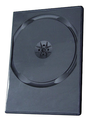
This was the blank dvd case picture we found on google images which we used in our magazine ad. Using photoshop we changed the dimensions of the dvd cover to make it fit over the blank case.

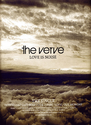
The Verve Magazine Advert


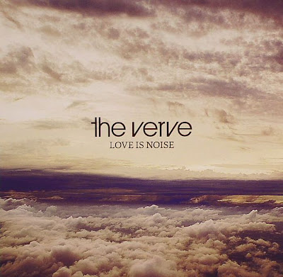
As You can see from the images above i will be analyzing The Verves Magazine advert for the single 'Love is Noise' 
And as you can see they share a lot of similarities this being anything from the background of the clouds which are very similar apart from the mag ad being very slightly darker.
With the background being almost identical and with the text used being the same it is almost impossible  to not be able to recognize what the ad is advertising.
But again there is no initial picture of the album itself.

Development of the DVD cover / Digipak

Originally, our design for the digipak was going to have a background of 'white denim' on the front cover. When we come to put a photo of the band on the background, it didn't work well, as the band didn't fit with the white denim.

Luckily, the background of the band shot was plain white. This lent itself well to being edited. We edited the band shot to have an animated look to it. This was to match the bands previous album cover.

Also with the logo we decided in the end to use the original shown below Rather than the logo we tweaked. This is due to the fact that after changing the original design of the DVd cover we found that the original logo fitted far better as it look far more professional whereas the one we tweaked looked out of place and more amateur.

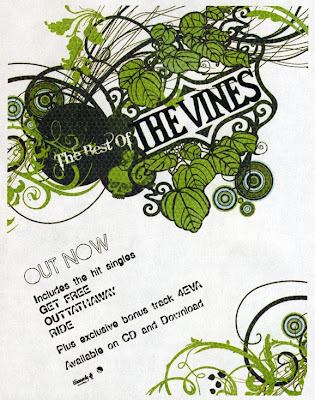
Real Magazine Adverts


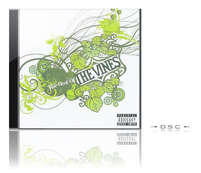
I am going to analyze  the magazine advert for The vines Greatest hits
From the ad this ad you can see that the vines have taken many influences from there album for instance the graphics are very similar to those of the album including the vine like graphics and there signature lettering.
However There is no actual sign of the album itself on the ad which is rather strange and therefore ours won't look particularly similar .

Tuesday, 24 November 2009

Magazine Advert

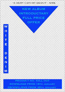
This is our preliminary design for the graphics overlay of out Digipak advert. Notice how the graphics coincide with the graphics featured in our video. This is to keep a motif throughout the work.

The advert has conventions of adverts. It has a review quote at the top, from NME, a renowned music magazine aimed at people who would listen to White Denim. It also has the release dates, which tell people when the album is released.

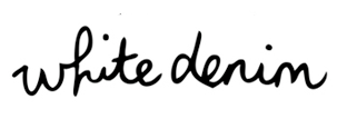
Band logo

For the band logo with have decided to use the official logo as we believe it will fit perfectly into the style of dvd we are hoping to produce.
However we have made a couple of tweaks, these being stitches above and below the logo to make it go with the image of white denim.


The original

The tweaked logo

Friday, 20 November 2009

DVD cover design

The below picture will be the design for our dvd cover, the image of the band will be replaced by a picture of our band in a similar pose.


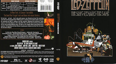
These two pictures are example of the bands previous artwork.


Thursday, 19 November 2009

Definition of digi pack

From wikipedia

Digipak is a patented style of compact disc or DVD packaging, and is a registered trademark of AGI Media, a MeadWestvaco, Inc. resource, which acquired the original trademark holder, IMPAC Group, Inc., in 2000. MeadWestvaco licensed the name and designs to manufacturers around the world.


Conventions of a Rock genre digi pack


Typical conventions

  • Band name in bold at top
  • Picture and images of band
  • A lot of dark areas apart from the images which stand out on the black background

We plan to take our dvd cover in a different direction due to the difference in the genre and styles. As opposed to a dark background, our dvd cover will have a white background which goes with the bands image.

Music video final


Feedback

Video was surreal however too hard to understand at times,

Had a range of good shots,

Humor worked well,

Visuals matched the music well,

Good ideas,

Similar style to foo fighters videos,

Some parts looked amateur/tacky however it worked well with the theme of a tacky shopping channel

Tuesday, 10 November 2009

Teacher Feedback on Blog

with regards to your rough cut feedback - your "response to feedback" is not acceptable and must be discussed in terms of which advice you accept and what you need to to now in order to improve. don't forget to take screen grabs of final cut and discuss your progress on your blog.

Dvd Cover Design Ideas

For the DVD cover, we have a clear idea of how it will look. The idea is to carry on the shopping channel theme with the band being the main part of the cover. They may be standing in front of a piece of white denim and will be posing in a typical promotional image stance. Example below:

This is a stereotypical pose for most rock bands. This therefore is the simplest shot we could use for our band.
Whereas the image below shows a more unique pose which gives the band a more playful look, which could also fit with our video due to the light-hearted style.

We will take photos in both styles, then we'll see which one fits best with the white denim background and use that one.

Friday, 6 November 2009

Rough Cut Feedback

Feedback
  • The music fits to what is happening on screen.
  • Really like the shopping channel spoof
  • Didn't understand the story or the title cards.
  • Good ideas and techniques
  • Hard to follow at times
  • Hand coming out of the box looked good
  • Fill in the gaps and make it easier to follow
Response to feedback

In response to the feedback, we acknowledged the fact that people didn't understand what was happening and couldn't follow the story. Therefore we are going to solve this by first of all filling the gaps with the footage we were missing and tweaking the storyline.

Thursday, 5 November 2009

review of editing

The editing went well considering the lack of footage of the band playing, we replaced the missing footage with text and pictures explaining what will be included in the missing scenes. The graphics included worked well and turned out to be simpler to apply than we had imagined and gave the desired impression of a shopping channel.

Target Audience

Our target audience would be the 16-24 age bracket. Our piece is an attack on the shopping channels common on digital and satellite television, the video is also a wider comment on materialism and the commercialization of music and the arts.

White Denim's target audience is probably quite similar to the target audience of our video, perhaps a year or two younger, as the song is quite juvenile and not very complex.

Equipment list

Equipment needed in the video

Filming 1: Shopping Channel
shopping channel products/items i.e. Duster, watch, sudoku cube and drum

backdrop and table with cloth.

Smart clothing

Filming 2: Lounge

Lounge setup which included chair, table, scattered rubbish, a TV, a box and a clipboard and pen.
 
© 2009 GROUP 33 - Music Video 2009/10. All Rights Reserved | Powered by Blogger
Design by psdvibe | Bloggerized By LawnyDesignz