http://www.youtube.com/watch?v=JqjYAp2GiwY
http://www.youtube.com/watch?v=fsHDc_J_btg
Showing posts with label adam. Show all posts
Showing posts with label adam. Show all posts

Thursday, 10 December 2009
Music Video Evaluation
In what ways does your media product use, develop or challenge forms and conventions of real media products?
Our media products use many of the conventions of different forms of media texts. The main part of our video, the shopping channel segments, follow closely the genre and style conventions of shopping channels, like Bid TV, Price Drop TV and QVC. The props, costumes and general mise en scene in the shopping channel shots in the video, faithfully recreate the shopping channel scenario, whilst poking fun and spoofing the whole look and feel of the effect.
The graphics that are superimposed on the shopping channel segments, were created to follow the conventions of the shopping channel look. Also included in the graphics we made were jokes and small ‘easter eggs’ in the text. These jokes are there for people who watch the video more than once. They don’t see the jokes first time round, so the jokes add repeat viewing value to the video.
Although the shopping channel part of the video follows the conventions of shopping channels, by putting that scenario in a music video, it gives it a unique look and feel, which will help an audience identify the music video easier.
The performance and ‘lounge’ parts of the video follow conventions of indie rock music videos. The costumes worn by the band, the props used by the person by the TV, and the layout of the sets (the band’s ‘performance studio’ and the man’s lounge), all follow music video conventions. The camerawork, however, fits the band performance into the shopping channel setting, allowing for the two parts of the video to flow with each other.
How effective is the combination of your main product and ancilliary texts?
The digipack we created was a DVD cover, which didn’t match the style of the music video. Instead, we choose to model the cover on the band’s (White Denim) previous album artwork. Their last album cover had a painted look to it, and in keeping with this, our product had a similar effect. We used a band photo, conventional of most indie bands, then edited it to give it a cartoon-esque look. So whilst following the style of the band’s artwork, we also moved it on and did something different with the look.
The back cover of the digipack contains information that is typical of a back cover of a digipack. This includes the track listing, a DVD logo, screenshots from the music video (which act as a selling point for the digipack) and a list of the special features on the DVD. The background image, is the band photo from the front cover, reversed and silhouetted. This gives the band a distinct image, making them easily identifiable to a potential buyer.
The advert for the digipack, brings together elements from both the music video and the digipack, to give the ancilliary products an effective motif. The advert uses the band photo from the digipack and is silhouetted, like the background of the back cover of the digipack. The graphics from the music video form part of the advert. By using and adapting the graphics from the video and using them in the advert (along with the font and colour scheme), it creates a motif across the products. This would help the sale of the digipack, as people would recognise the graphics from the video, see the DVD cover and go and buy the digipack because it has that video on it.
What have you learnt from your audience feedback?
When we posted up our rough-cut, most of the feedback we received all said the same thing. The comments mainly mentioned the lack of variety in the shots, as well as a lack of whole scenes, with made the video confusing and hard to follow. We responded to this feedback by filming the shots needed to make the video make sense. This include several scenes involving the band playing on the shopping channel and in the apartment, as well as shots of the apartment and it’s owner, reacting to various band members.
After the final cut of our video was done, the feedback we received on it, was general positive. A few praised the surreal feel of the video, whilst commenting on the fact that the humour work well as was not to over the top. Comments also said that the video had a tacky look to it, but that that work with the shopping channel look. If we could go back and change one thing, we would reshoot the apartment scenes, and make them look less tacky and more like an actual lounge in an apartment.
Feedback from the digipack and advert was also mainly positive. People liked the way the image of the band, and how the overall look and theme carries on over both sides of the box and that the band where the same as they were in the video (the costumes, props and background colour were the same, to add continuity). However, some people did mention that the background picture on the back takes away from the over all look. Looking at the cover again, the image clearly stands out, and doesn’t really fit with the rest of the cover. If we did it again, we would probably make the background image, a little more translucent, to draw attention to the text on the back. The advert was praised for having a good link between the video (making the advert look like a TV shopping channel screen) and digipack cover. It was called unique, and that it is quite recognisable to an audience, making the product stand out The theme and the inclusion of release dates and website, were also liked.
How did you use new media technologies in the construction and research, planning and evaluation stages?
During the project, we used several new media technologies. At the planning stage, we used Youtube to research the shopping channel effect. We looked at clips from Bid TV, QVC and many others, to see how the graphics looked, and how they were shot. This massively influenced our music video.
Whilst researching, we found spoofs of the shopping channel format. This were a little more extreme, because they showed things being sold that would never be sold on a shopping channel. After seeing this we realised that to make the shopping channel part work, we would need to make it look and feel as much like the real thing as possible.
We also used Google to research, and acquire still images of, shopping channel graphics and previous digipack covers and adverts. This helped in the develop of all three of the projects we made. A blog was used throughout the project to chart the progress of the products. During the making of the digipack cover and advert, we used the blog as a ‘bin’, putting shots of the digipack on it, for us to take off, copy and use in the advert, and vice versa.
Photoshop was used to make graphic designs for shopping channel parts of the video, as well as the advert. It helped when the graphics were added to the music video, as the programmes Final Cut (used to edit the video) and Photoshop integrate and work together perfectly. We also used Photoshop to make a moodboard to help the creative process. We also emailed the band, White Denim, to tell them that we used their song, and to see if they wanted to see a version of it or not. They didn’t reply, however. At the evaluation stages, we used technologies we used before (Photoshop, Final Cut, Google) to make a group commentary. This helped to see what went well, and what could have been done more successfully.
Our media products use many of the conventions of different forms of media texts. The main part of our video, the shopping channel segments, follow closely the genre and style conventions of shopping channels, like Bid TV, Price Drop TV and QVC. The props, costumes and general mise en scene in the shopping channel shots in the video, faithfully recreate the shopping channel scenario, whilst poking fun and spoofing the whole look and feel of the effect.
The graphics that are superimposed on the shopping channel segments, were created to follow the conventions of the shopping channel look. Also included in the graphics we made were jokes and small ‘easter eggs’ in the text. These jokes are there for people who watch the video more than once. They don’t see the jokes first time round, so the jokes add repeat viewing value to the video.
Although the shopping channel part of the video follows the conventions of shopping channels, by putting that scenario in a music video, it gives it a unique look and feel, which will help an audience identify the music video easier.
The performance and ‘lounge’ parts of the video follow conventions of indie rock music videos. The costumes worn by the band, the props used by the person by the TV, and the layout of the sets (the band’s ‘performance studio’ and the man’s lounge), all follow music video conventions. The camerawork, however, fits the band performance into the shopping channel setting, allowing for the two parts of the video to flow with each other.
How effective is the combination of your main product and ancilliary texts?
The digipack we created was a DVD cover, which didn’t match the style of the music video. Instead, we choose to model the cover on the band’s (White Denim) previous album artwork. Their last album cover had a painted look to it, and in keeping with this, our product had a similar effect. We used a band photo, conventional of most indie bands, then edited it to give it a cartoon-esque look. So whilst following the style of the band’s artwork, we also moved it on and did something different with the look.
The back cover of the digipack contains information that is typical of a back cover of a digipack. This includes the track listing, a DVD logo, screenshots from the music video (which act as a selling point for the digipack) and a list of the special features on the DVD. The background image, is the band photo from the front cover, reversed and silhouetted. This gives the band a distinct image, making them easily identifiable to a potential buyer.
The advert for the digipack, brings together elements from both the music video and the digipack, to give the ancilliary products an effective motif. The advert uses the band photo from the digipack and is silhouetted, like the background of the back cover of the digipack. The graphics from the music video form part of the advert. By using and adapting the graphics from the video and using them in the advert (along with the font and colour scheme), it creates a motif across the products. This would help the sale of the digipack, as people would recognise the graphics from the video, see the DVD cover and go and buy the digipack because it has that video on it.
What have you learnt from your audience feedback?
When we posted up our rough-cut, most of the feedback we received all said the same thing. The comments mainly mentioned the lack of variety in the shots, as well as a lack of whole scenes, with made the video confusing and hard to follow. We responded to this feedback by filming the shots needed to make the video make sense. This include several scenes involving the band playing on the shopping channel and in the apartment, as well as shots of the apartment and it’s owner, reacting to various band members.
After the final cut of our video was done, the feedback we received on it, was general positive. A few praised the surreal feel of the video, whilst commenting on the fact that the humour work well as was not to over the top. Comments also said that the video had a tacky look to it, but that that work with the shopping channel look. If we could go back and change one thing, we would reshoot the apartment scenes, and make them look less tacky and more like an actual lounge in an apartment.
Feedback from the digipack and advert was also mainly positive. People liked the way the image of the band, and how the overall look and theme carries on over both sides of the box and that the band where the same as they were in the video (the costumes, props and background colour were the same, to add continuity). However, some people did mention that the background picture on the back takes away from the over all look. Looking at the cover again, the image clearly stands out, and doesn’t really fit with the rest of the cover. If we did it again, we would probably make the background image, a little more translucent, to draw attention to the text on the back. The advert was praised for having a good link between the video (making the advert look like a TV shopping channel screen) and digipack cover. It was called unique, and that it is quite recognisable to an audience, making the product stand out The theme and the inclusion of release dates and website, were also liked.
How did you use new media technologies in the construction and research, planning and evaluation stages?
During the project, we used several new media technologies. At the planning stage, we used Youtube to research the shopping channel effect. We looked at clips from Bid TV, QVC and many others, to see how the graphics looked, and how they were shot. This massively influenced our music video.
Whilst researching, we found spoofs of the shopping channel format. This were a little more extreme, because they showed things being sold that would never be sold on a shopping channel. After seeing this we realised that to make the shopping channel part work, we would need to make it look and feel as much like the real thing as possible.
We also used Google to research, and acquire still images of, shopping channel graphics and previous digipack covers and adverts. This helped in the develop of all three of the projects we made. A blog was used throughout the project to chart the progress of the products. During the making of the digipack cover and advert, we used the blog as a ‘bin’, putting shots of the digipack on it, for us to take off, copy and use in the advert, and vice versa.
Photoshop was used to make graphic designs for shopping channel parts of the video, as well as the advert. It helped when the graphics were added to the music video, as the programmes Final Cut (used to edit the video) and Photoshop integrate and work together perfectly. We also used Photoshop to make a moodboard to help the creative process. We also emailed the band, White Denim, to tell them that we used their song, and to see if they wanted to see a version of it or not. They didn’t reply, however. At the evaluation stages, we used technologies we used before (Photoshop, Final Cut, Google) to make a group commentary. This helped to see what went well, and what could have been done more successfully.
Thursday, 3 December 2009
Group Commentary Script
QUESTION 1 - In what ways does your media product use, develop or challenge forms and conventions of real media products?
We used graphics created on photoshop, and appropriate mise en scene to create the shopping channel effect. While we were making fun of and spoofing the genre using jokes in text on the graphics and a tacky appearance, we always remained faithful to the conventions of shopping channels.
The band appearance and performance follow the conventions of typical rock/indie bands, but in shopping channel scenario, as reflected by the camera work and editing.
QUESTION 2 - How effective is the combination of your main product and ancilliary texts?
The Digipack is very conventional of indie bands as we based the design on some of the bands previous artwork, we did the same for the photo of the band, using the cartoon/painted style.
The magazine advert takes elements of both of the music video and the digipack. The image on the back cover of the digipack, the front cover of the digipack and the graphics/font all link in with the music video.
QUESTION 3 - What have you learnt from your audience feedback?
The feedback we received on the rough cut commented on the missing footage (mostly of the band performance), and on the video being hard to follow. We responded by filming the band shots, and other shots to make the narrative part of the video flow and make sense.
The feedback we got on the final version of the video was generally positive, praising the surreal look and feel, the fact the humour worked well and that the tacky shopping channel look worked well.
QUESTION 4 - How did you use new media technologies in the construction and research, planning and evaluation stages?
We used youtube and google in the initial research stages to look up the shopping channel effect/style and also to look at previously created spoofs and actual footage of shopping channels. We used the internet to search for existing logos and previous covers and adverts. We used photostop to make all the graphic designs for the shopping channel scenes in the video, as well as using it to create the advert and dvd cover. Other uses of photoshop were creating moodboards to help the creative process. We also used the internet to email the band to tell them that we used their song.
We used graphics created on photoshop, and appropriate mise en scene to create the shopping channel effect. While we were making fun of and spoofing the genre using jokes in text on the graphics and a tacky appearance, we always remained faithful to the conventions of shopping channels.
The band appearance and performance follow the conventions of typical rock/indie bands, but in shopping channel scenario, as reflected by the camera work and editing.
QUESTION 2 - How effective is the combination of your main product and ancilliary texts?
The Digipack is very conventional of indie bands as we based the design on some of the bands previous artwork, we did the same for the photo of the band, using the cartoon/painted style.
The magazine advert takes elements of both of the music video and the digipack. The image on the back cover of the digipack, the front cover of the digipack and the graphics/font all link in with the music video.
QUESTION 3 - What have you learnt from your audience feedback?
The feedback we received on the rough cut commented on the missing footage (mostly of the band performance), and on the video being hard to follow. We responded by filming the band shots, and other shots to make the narrative part of the video flow and make sense.
The feedback we got on the final version of the video was generally positive, praising the surreal look and feel, the fact the humour worked well and that the tacky shopping channel look worked well.
QUESTION 4 - How did you use new media technologies in the construction and research, planning and evaluation stages?
We used youtube and google in the initial research stages to look up the shopping channel effect/style and also to look at previously created spoofs and actual footage of shopping channels. We used the internet to search for existing logos and previous covers and adverts. We used photostop to make all the graphic designs for the shopping channel scenes in the video, as well as using it to create the advert and dvd cover. Other uses of photoshop were creating moodboards to help the creative process. We also used the internet to email the band to tell them that we used their song.
Friday, 27 November 2009
Final Advert
 This is the finished advert.
It has good continuity with the video, and it fits well with the box cover. We like the theme, and its good that the dates of release are clear and that it shows websites where the digipack is available from.
Like the link between this and video, clever making it like a tv sales screen, think its unique and quite recognisable to audiebce making you stand out.
DVD ad

This was the blank dvd case picture we found on google images which we used in our magazine ad. Using photoshop we changed the dimensions of the dvd cover to make it fit over the blank case.
Development of the DVD cover / Digipak
Originally, our design for the digipak was going to have a background of 'white denim' on the front cover. When we come to put a photo of the band on the background, it didn't work well, as the band didn't fit with the white denim.
Luckily, the background of the band shot was plain white. This lent itself well to being edited. We edited the band shot to have an animated look to it. This was to match the bands previous album cover.
Luckily, the background of the band shot was plain white. This lent itself well to being edited. We edited the band shot to have an animated look to it. This was to match the bands previous album cover.
Also with the logo we decided in the end to use the original shown below Rather than the logo we tweaked. This is due to the fact that after changing the original design of the DVd cover we found that the original logo fitted far better as it look far more professional whereas the one we tweaked looked out of place and more amateur.
Tuesday, 24 November 2009
Magazine Advert
 This is our preliminary design for the graphics overlay of out Digipak advert. Notice how the graphics coincide with the graphics featured in our video. This is to keep a motif throughout the work.
The advert has conventions of adverts. It has a review quote at the top, from NME, a renowned music magazine aimed at people who would listen to White Denim. It also has the release dates, which tell people when the album is released.
Thursday, 19 November 2009
Music video final
Feedback
Video was surreal however too hard to understand at times,
Had a range of good shots,
Humor worked well,
Visuals matched the music well,
Good ideas,
Similar style to foo fighters videos,
Some parts looked amateur/tacky however it worked well with the theme of a tacky shopping channel
Tuesday, 10 November 2009
Dvd Cover Design Ideas
For the DVD cover, we have a clear idea of how it will look. The idea is to carry on the shopping channel theme with the band being the main part of the cover. They may be standing in front of a piece of white denim and will be posing in a typical promotional image stance. Example below:
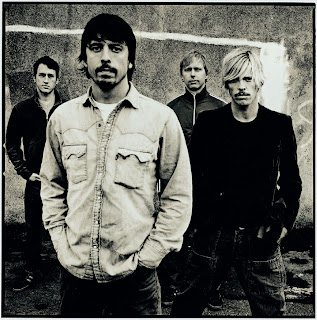 This is a stereotypical pose for most rock bands. This therefore is the simplest shot we could use for our band.
Whereas the image below shows a more unique pose which gives the band a more playful look, which could also fit with our video due to the light-hearted style.
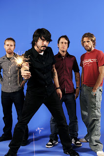
We will take photos in both styles, then we'll see which one fits best with the white denim background and use that one.
 This is a stereotypical pose for most rock bands. This therefore is the simplest shot we could use for our band.
Whereas the image below shows a more unique pose which gives the band a more playful look, which could also fit with our video due to the light-hearted style.

We will take photos in both styles, then we'll see which one fits best with the white denim background and use that one.
Friday, 6 November 2009
Rough Cut Feedback
Feedback
In response to the feedback, we acknowledged the fact that people didn't understand what was happening and couldn't follow the story. Therefore we are going to solve this by first of all filling the gaps with the footage we were missing and tweaking the storyline.
- The music fits to what is happening on screen.
- Really like the shopping channel spoof
- Didn't understand the story or the title cards.
- Good ideas and techniques
- Hard to follow at times
- Hand coming out of the box looked good
- Fill in the gaps and make it easier to follow
In response to the feedback, we acknowledged the fact that people didn't understand what was happening and couldn't follow the story. Therefore we are going to solve this by first of all filling the gaps with the footage we were missing and tweaking the storyline.
Thursday, 5 November 2009
Target Audience
Our target audience would be the 16-24 age bracket. Our piece is an attack on the shopping channels common on digital and satellite television, the video is also a wider comment on materialism and the commercialization of music and the arts.
White Denim's target audience is probably quite similar to the target audience of our video, perhaps a year or two younger, as the song is quite juvenile and not very complex.
White Denim's target audience is probably quite similar to the target audience of our video, perhaps a year or two younger, as the song is quite juvenile and not very complex.
Equipment list
Equipment needed in the video
Filming 1: Shopping Channel
shopping channel products/items i.e. Duster, watch, sudoku cube and drum
backdrop and table with cloth.
Smart clothing
Filming 2: Lounge
Lounge setup which included chair, table, scattered rubbish, a TV, a box and a clipboard and pen.
Filming 1: Shopping Channel
shopping channel products/items i.e. Duster, watch, sudoku cube and drum
backdrop and table with cloth.
Smart clothing
Filming 2: Lounge
Lounge setup which included chair, table, scattered rubbish, a TV, a box and a clipboard and pen.
Thursday, 1 October 2009
Music Video Analysis
The video for Uprising, by Muse, has many of the characteristics of the rock music genre. A large part of the video is taken up by the band performing the song. This is typical to rock videos. There is also a small narrative, involving giant Teddy Bears that rise up and begin to destroy the city. The explosions and flying sparks are also visuals you can find in many rock videos. These fly across the screen in slow-motion, which gives the song, along with the video, an epic feel.
The bears are matching the lyric in the song ‘rise up and take the power back’, as they take control of the city. This shows that the lyrics connect to the visuals. Something that also connects to the visuals, this time the explosions and glass smashes, is the music. The glass smashing only occurs in time with the drum beat, while the explosions start when the chorus of the song beings.
Because the record label requires shots of the band or artist to sell the product, close-up shots of the lead singer, the drums being played and the guitarists guitar are all included in the video. Some of the motifs that run though Muse’s video, are also in this video. The use of explosions is common in Muse videos, as is their unusual costumes. These help the record label, and the band, have a clear and unique image, so you can tell that you are watching a Muse video.
The video has a clear intertextual reference to monster movies, such as Godzilla (Honda), King Kong (Cooper & Schoedsack, 1933) and Cloverfield (Reeves, 2008). The bears are destroying the city, much like monsters from monster movies. By using teddy bears, something that is not very monster-like, instead of monsters, the video creates a unique twist on a classic story.
Autuer Research
U1 Autuer Project
View more presentations from guest00b72f.
U1 Auteur Tcomplete
View more presentations from guest00b72f.
U1 Presentation Jonathan Glazer
View more presentations from guest00b72f.
Other influences
Whilst developing the ideas for the video, we looked on youtube for more inspiration. We found a couple of videos which helped us develop our final idea.
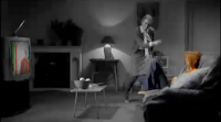
Shown above is a screen shoot from one of the Music video that influence our final idea ( Mc fly Five colours in her hair). The reason why this particular music video influenced us, was the fact that it had basically the the exact same shot we were trying to create. Our shot will be a side-on and low angle shot, showing the TV, which is rather different to this shot. But we will also be taking the idea of everything being black and white apart from the tv.
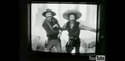
http://www.youtube.com/watch?v=rEETC3msD9U
Above is a link the to the second video that influenced us.
This video has a particular scene, which we thought would be great in our music video. This scene being 3.19 mins in and ending 3.24mins. The scene shows the tv flicking through many different tv channels. This will also be in our music video only with each channel being a shopping channel.

Shown above is a screen shoot from one of the Music video that influence our final idea ( Mc fly Five colours in her hair). The reason why this particular music video influenced us, was the fact that it had basically the the exact same shot we were trying to create. Our shot will be a side-on and low angle shot, showing the TV, which is rather different to this shot. But we will also be taking the idea of everything being black and white apart from the tv.

http://www.youtube.com/watch?v=rEETC3msD9U
Above is a link the to the second video that influenced us.
This video has a particular scene, which we thought would be great in our music video. This scene being 3.19 mins in and ending 3.24mins. The scene shows the tv flicking through many different tv channels. This will also be in our music video only with each channel being a shopping channel.
Friday, 25 September 2009
First Graphic Design
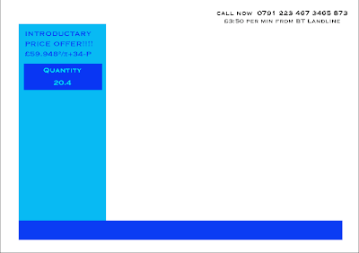
This is a first early design for the graphics that will appear in the shopping channel parts of the video.

inspirations for the music video
White Denim Let's Talk about it
This is the song that our group has chosen to make a music video for.
When brainstorming ideas Our group came up with the idea of a Shopping channel video involving spoofing the genre of the shopping channel.
To help in developing of our ideas, we watched clips of shopping channels. These are a couple of examples:
This is the song that our group has chosen to make a music video for.
When brainstorming ideas Our group came up with the idea of a Shopping channel video involving spoofing the genre of the shopping channel.
To help in developing of our ideas, we watched clips of shopping channels. These are a couple of examples: