Our Media Product uses many forms and conventions of real Rock/Indie genre music videos, examples of these being anything from the band being the ‘centre of attention’ in many of the shots which is very common in indie and rock music videos For example: Kasabian’s Shoot the Runner video which is solely based round the band, our video may be the complete opposite of this but it still does take elements of this ‘centre of attention’ style from the video these being the band performance.
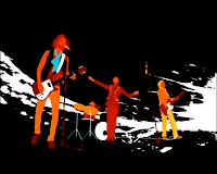
But our Music Video also takes this a stage further with influence from other rock bands such bands as Foo Fighters with the song Learn To Fly and the Beastie Boys with Sabotage where the band is still the ‘centre of attention’ but they are involved in somewhat of a comedy story or spoof. Our video also does this spoof idea with the spoof being shopping channels. Our idea was to take the shopping channel feel of tackiness but take it to a whole new level with the products being completely useless that is until the band comes along.
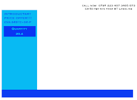
We were able to produce this shopping channel feel by using graphics created on Photoshop, and appropriate mise en scene to create the shopping channel effect. While we were making fun of and spoofing the genre using jokes in text on the graphics to give a tacky appearance, we always remained faithful to the conventions of shopping channels. As if we were to go too tacky the audience would become confused and would not be able to tell that we were spoofing the shopping channel theme.
The band appearance and performance follow the conventions of typical rock/indie bands, but in shopping channel scenario, as reflected by the camera work and editing.
Therefore I believe our video followed all the conventions in the music genres our band White Denim came under but we also developed these further with the added bonus of the shopping channel spoof which therefore created an overall professional feel.
How effective is the combination of your main product and ancilliary texts?
The Digi pack is very conventional of that of other indie bands But There is no clear influence from our music video on the front cover, this is because we decided in the end that if we used the shopping channel feel it would look too tacky and therefore the end product we ended up with was based round the design of the bands single ‘Let’s talk about it’ this cover shown below is of one of the band members in a almost painted style we therefore got a conventional rock band style picture similar to the likes of Foo fighters but with the added White denim cartoon/painted styled look. However we did link the music video to the digi pack through the underside of the digi pack which we based round the Led-Zepplin The Song Remains The Same
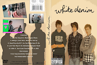
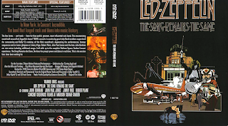
The magazine advert takes elements from both the music video and the digipack. The image of the front cover of the digipack is in the dead centre of the Magazine advert this is very conventional as most Magazine covers we have seen of other bands include this although ares is slightly different as it has been superimposed onto a dvd case to give it a more professional quality. We also used the original graphic
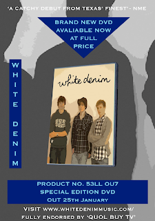 template used throughout the music video this therefore links the original video with the magazine advert so that people that see the advert will instantly know what it is advertising. With the Graphics We also included some of our hidden words in the product numbers (by this i mean hidden words such as SELLOUT displayed of the magazine cover as 53llOU7) that people will pick up on if they watch our music video beforehand. We also used many over things to tie the digi pack and the magazine advert together these included The use of the silhouette of the band on the underside of the digi pack was flipped and change to black and white and then used to create the background for the magazine advert.
We also used all the sorts of information you would find on both a digi pack and a magazine advert these included anything from the parental guidance logo to the more less know logos such as the Dolby Digital logo these therefore gave an even more authentic look which is what we were trying to achieve.
We even made fake quotes from popular music magazines such as NME and Q Magazine these included: “Fresh new sound” NME and “Funny, Energetic, Amazing collection” Q magazine. These therefore linked the Digi pack and the Magazine advert further.
What have you learnt from your audience feedback?
With the original feedback we got when we showed people the rough cut we found that the same points were mentioned this included That the video was hard to follow and that there was missing footage throughout. We found this understandable as at this point we had only filmed the shopping channel shots and therefore were missing all the band performance shots which in our case were quite a reasonable chunk of footage.
We therefore responded by filming the Band performance shots and any other shots needed to complete the narrative This therefore allowed the video to flow much more smoothly allowing the people which commented on the rough cut saying it was confusing to have a far better sense of what the story actually was. Apart from this the comments we got on our rough-cut were all pleasing these included: The music fits to what is happening on screen, Really like the shopping channel spoof, Good ideas and techniques, Hand coming out of the box looked good, Some parts looked amateur/tacky however it worked well with the theme of a tacky shopping channel obviously as i said these pleased us as the look we were hoping to get of a tacky shopping channel that was of the same look as the Foo Fighters was exactly what the viewers got from watching it.
Therefore after placing the missing footage in the gaps we also tweaked a few of the shots we already had to make it more suited to the rock genre. By using angled shots of guitar playing and more unusual shots of the band itself we seemed to achieve this.
As from the final feedback we had from the final cut showed
The feedback we received on the rough cut commented on the missing footage (mostly of the band performance), and on the video being hard to follow. We responded by filming the band shots, and other shots to make the narrative part of the video flow and make sense.
The feedback we got on the final version of the video was generally positive, praising the surreal look and feel, the fact the humour worked well and that the tacky shopping channel look worked well. Which therefore showed that the target audience approved of the video we created, and from the comments given we also designed the digi pack and magazine advert therefore allowing continuity and in doing so pleasing the audience again.
How did you use new media technologies in the construction and research, planning and evaluation stages?
Without the use of new technologies the process of researching to evaluation would of taken a far longer time than what was given but luckily we did have access to programs that could provide help throughout each stage. For example in the intial research stages we would not have been able to carry out research as thoroughly without the help of such internet sites as ‘YouTube’ and ‘Google’. With the help of these programs we were able to search through everything from existing logos of real shopping channels to the actual layout of the graphics. With the use of YouTube we were also able to look at previous shopping channel spoofs and actual footage from shopping channels which therefore allowed use to develop our idea of a shopping channel spoof to create a very unique video. But before the construction of the video, there was still research needing to be done this included using the program ‘Photoshop’ to create mood boards from images found again on Google and Annotating screen shots we have taken from the internet of existing shopping channels to then progress onto making the first shopping channel graphics for the video. And then of course there was the internet site Myspace which allowed use to contact the band to get permission to use the song.
The next stage was then the actual construction of the video which would of never been constructed without using the program Final Cut Express, This program allowed us to be able to create a near perfect professional feel to our video. While creating the storyline using this program we were also able to put the graphics we had previously worked on in Photoshop straight onto the sequence required, this provided us with the tacky shopping channel spoof look we were after. With the storyline and graphics finished we could then fiddle with the contrast and colour of the footage to give it that glossy professional feel ,and then add our own personal touch by using crazy effects such as the price earthquake sequence which we use the earthquake effect from Final Cut Express or the breaking of the camera scene at the very end which we again used a Final Cut Express effect. After completing the video we were then able to straight away upload the video onto the blog that we had been using throughout or onto the site we used previously ‘YouTube’ for other to enjoy and rate.
After constructing the video we obviously still had the two other products to make these being the magazine advert and the digi pack, both of which were created using the program Photoshop with this program we were then able to give the effects we were after for the digi pack this being the ‘painted’ look with the use of the Photoshop it was really easy to apply and with a few added items from the internet such as the dvd logo and with the ability to take screen shots from Final Cut Express we were able to create a very convincing Dvd album cover.
Photoshop however really came into play when we created the mag advertisement this was due to the fact that there was so much to do not only did we have to put the graphics in that we had previously used we also had to superimpose a picture of the digi pack onto a picture of a dvd case we found on the internet we then even more impressively used the silhouette of the band flip it and change the colour to black and white and used it as our background.
Overall I have found that without the programs and technology we were given it would have been near impossible to create as professional looking products as with did in the end.
No response to “Evaluation”
Leave a reply